Monday, February 4, 2013

Artist's Residence

Concept Diagram


Site

Section
Superimposed floor plans

This project was a very small house connected to a large warehouse that was converted into a studio. The residence was to be designed for the late artist Lebbeus Woods.


Mr. Woods in his house

Much of Woods' work was provocative and edgy. A common theme in this work is the contrast between the established and wild sci-fi inventions. Woods spoke a language of sharp angles in his art, but the photo of him in his home suggested that he didn't want to live in an environment as harsh as his art. My goal was to create a design that would reconcile the angles of Woods' work, and the light, clean environment that was his home. 


The Bellefonte Library


The Stacks


First floor plan


Longitudinal Section


This project was a design for a little community library in the town of Bellefonte, PA. The site was a challenge - a very thin, long site that had once been a medical supplies store. Meanwhile, in my architectural theory class, we were studying the greatest architects of the 20th century, including Louis Khan.  


Exeter Library, Louis Khan

I was inspired by the monumentality of the work of Louis Kahn, which led me to investigate other works with a similar spirit. I discovered the work of Peter Zumthor, and was impressed by two of his works in particular:


...The Bruder Klaus Chapel...


...and the Vals Spa in Switzerland.

All of these projects have a sense of monumentality, and I set out to figure out how they managed to create this feeling. When one of my professors gave a lecture on stereotomy and tectonics, it finally clicked. The spaces I loved so much were ones that seemed almost carved out somehow. The feeling I was trying to accomplish was that of stereotomy. 

My goal with this project was to create a heavy, monumental space for the keeping of the books, and to contrast it, a light, airy space at the top of the building for reading. 

concept diagram


cross section


Wednesday, October 12, 2011

Jewels on College Ave


Here's my little scheme for a tiny jewelry store on College Ave.

In a way, this was my first real architecture project at school.
The program called for a jewelry store at a specific existing site on College Ave. The current occupant of this site is a small clothing store. It's footprint is about 20' x 50' x 16'.

We were first instructed to choose jewelry that would inspire the design for our space.

Here were a few pieces that interested me:

Alexis Bittar

"On Gossamer Wings" Culoyon

"Undulate" Tataborello

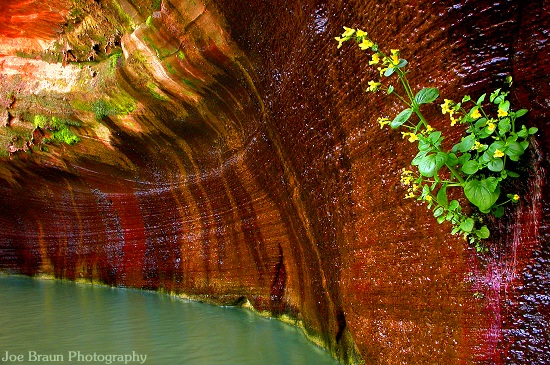
One thing that I like about all three of the above pieces is that they have a certain elegance and movement to them, without seeming too posh or stuck up. Each of them has a somewhat organic appeal, and that quality reminded me of Zion National Park. The rugged elegance of the canyon walls there was ideal for my design vision.


Canyon Walls at ZNP

Here is an image of my proposed facade in the context of its neighbors on College Ave, which was inspired by the movement of my chosen pieces of jewelry and the canyon walls of Zion:

Elevation

My biggest struggle in this project was a tie between overcoming my fear of adding architectural features to such a tiny space, and using a computer to model my design. I initially felt that adding a lot of walls or floor features would be overwhelming, so I erred on the side of blandness - all I had in the space was a bathroom, the curved display counter, the seating area and the "floating wall". After my professor urged me to add more architectural interest, I devised this ceiling feature:


Reflected Ceiling Plan


Floor Plan


Section Looking Left


Section Looking Right


Perspective View from rear seating area.


Detail of built-in jewelry display.

Corbelletti Competition Entry #1


This is my first submission for the annual Corbelletti Design Charette. 

My proposal for the new Arts and Architecture pavilion is inspired by the cellular construction of plants. The region of campus that now houses the College of Arts and Architecture was formerly referred to as "Ag Hill" because it was the home of the College of Agriculture. I wanted to pay homage to the history of the site, while recognizing that it now has a vibrant new function. The program for the pavilion specified that the space should be able to accommodate dance, theater or musical performances, gallery shows, presentations, or workshops. It could not be larger than 1,000 square feet.  


Above you see a bigger image of my floor plan. As you can see, there are three primary spaces, and three secondary spaces. The regions that are shaded are closer to the top of the pavilion and those lighter are further away. In this plan, you can see the stage area which can be accessed by a ramp snaking around the right side of the largest space (the auditorium). The darkest green region is the observation deck looking over the first primary space and the party deck that extends outside.

My design is also intended to be broken down, relocated, and reconstructed easily. To accomplish this, my pavilion is constructed of individual modules or "cells." These units are made of a steel frame that holds a pane of glass, and a green cladding of recycled green plastic. This plastic membrane is designed to be easily popped on or off of the steel frame, depending on whether the pavilion needs to be shaded inside or in direct sunlight. 


Here are two sections that show the scale of the space. The image on the left is a cut through the the front of the  pavilion, looking back towards the stage area, and the one on the right is a cut through the right side of the building, looking left through the first primary space and parts the auditorium/Immersive Environments Lab.


{More about the Corbelletti Competition}

The Corbelletti Charette is held every year in honor of Raniero Corbelletti who served as the head of the Department of Architecture for twenty years. For the competition, all 2nd-5th year architecture students in Stuckeman have a design problem posed to them, and each of them has to design a structure that fulfills the program and must illustrate that structure using only one board. Students are encouraged to be inventive and experimental in their designs. 
The catch is that all of this must be done entirely by hand, without exception.
Out of over 200 anonymous entries, 7 finalists are chosen by a board of professors. A silent vote decides the winner. 

Monday, May 16, 2011

The Four-Ton Table


As promised, here are a few words and snapshots summarizing our design/build project at the Bar Pit:
(All photos courtesy Kelsey Ross and Brendan Westfall)


Meet the client.

 (Photo courtesy K.R.)

Al Matyasovsky is nothing short of a miracle worker. He opened the recycling center at the Bar Pit over 10 years ago, and he has been managing it ever since. Thanks to Al's hard work, the amount of trash that is recycled out of the university waste stream has jumped from about 19% to 59% in a little over 10 years. Despite how impressive Al sounds statistically, it is nothing compared to his character. He is easily the sweetest man I have ever met, with a passion for conservation and - cliche as it sounds - a passion for the well being of all people.
It was an honor to work for Al, and I hope that our gift to him and his employees lasts for a very long time.

Our project was to create a social space for the recycling plant at the Bar Pit, complete with landscaping, a wall, a projection screen, and a table for 40. The goal of this project was to be eco-friendly and to use recycled materials whenever possible.


Build the Pieces.

My section was assigned the table, which we designed out of concrete, glass and steel. We also designed and built 32 stools from concrete and recycled buckets, wood, aluminum and glass. All the glass was acquired from dumpsters around our university: 

To make this process extra-sketchy, much of the dumpster-diving was done under the cover of night.
(Photos courtesy B.W.)


We soaked the bottles in trash cans full of clean water for 24 hours before stripping them of labels.


After the bottles took their bath, we scraped their labels off.


We worked a lot of early mornings and late nights to collect and clean over a ton of glass.
(Our project manager, Josh, was not a huge fan of the Saturday and Sunday mornings.)


The glass was then crushed...


...And tumbled to remove sharp edges.


The tumbled glass was then mixed in with concrete and poured into molds we had made from recycled tables. Then each slab was carefully ground down and polished with a giant hand-operated griding machine, then slurried to fill in the holes left from air pockets.

The photo above is a close-up shot of a finished slab.


Two section 4 women did all the welding to make this frame which held the slabs.The trusses were made from reclaimed steel. (Hats off to you, girls!)
(Photos courtesy K.R.)


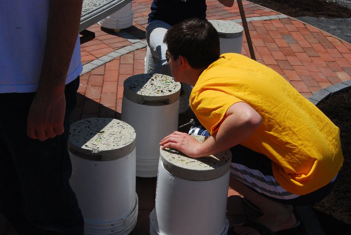
Here's a shot of our bucket seats. Each seat top was cast within the bucket itself, then pounded out and screwed onto the top.


Assemble It.

While section 4 was working on the table and chairs, the other groups were busy manufacturing and assembling their pieces as well:
Section 1 manufactured hundreds of individual blocks, which they transported by bike (no cars allowed) and stacked to create screen walls enclosing our build site, "The Terrace."
(Photos courtesy K.R.)


Section 2 created a general site plan, leveled the ground, and took care of some landscaping. The paving pattern at the site was made exclusively from materials (brick, stone, etc.) found at the Bar Pit.


Section 3 built a projection screen made of Trex for viewing presentations. They also pinned up a facade on the Bar Pit's white trailer to cut down on the glare, which made the area uncomfortable on sunny days.


Gradually, each support block, table top slab, and frame truss for our table were transported to the site from studio and assembled at The Terrace. The completed table weighed about 4 tons.


Bringing It All Together.

Though there were a few sunny days during the construction of our project, we generally worked through weather that one professor described as "biblical rain." So it was fitting, then, that our critique would be held on a rainy day as well.
Here are a few photos from the event:


(Photos courtesy K.R.)

The low parts of the wall doubled as overflow seating.

One neat guest we had at the critique was Michael Rotondi (pictured far right), the FAIA 2009 AIA Gold Medal Principal.
Check out his work here.
He arrived in parachute pants, and educated us on ways to tell cheap liquor from the good stuff.

We were criticized mainly for the edge we put on the table to prevent chips and cracks over time. One critic said that it was reminiscent of the edge on a grandma's dresser.


Al and the 1st year professors (from left: Marcus, James, Al, Jodi and Greg.)

All 1st year staff and students at
The Terrace at The Bar Pit.


Before.


After.


The entire project was completed (from design to production to assembly) in 9 weeks by about 60 students and 4 professors.