Tuesday, May 28, 2013

Sichuan Bistro Rennovation


Sichuan Bistro Before & After


Before this building in State College was The Sichuan Bistro, it was the home of Golden Wok. The building was originally an 18th century colonial home, but when the restaurant opened, the glass facade was added, and some time later, another room in the rear. Over the years, this building has undergone lots of transformations, and this year it experienced another one.


My partner Josh and I were hired to give the back rooms a new look. Our goal was to create something modern and comfortable, but distinctly oriental. 

We began in the smallest room of the restaurant. As the seating is adjacent to an area of high traffic, Josh and I set out to create more intimacy in the corridor-like space. 


We decided to update the space with a room divider made of metal pipes and oak slats. The wallpaper was removed, and the walls were covered with a fresh coat of paint.


Grey tiles will eventually replace the old laminate flooring (to conserve money, the owner wished to install the new tile floor himself).


The great thing about the restaurant is that is has good bones, even if its skin is outdated. 
When the back portion was built, many of the walls had custom curves and interesting little niches, like this one, which was being used to display a dusty fake plant:


Niche before


We used this little niche to create a focal point in the room with a painting suspended from the ceiling like a gong.

Niche after

_________________________________________________________________________________


The back room of the restaurant is probably the biggest one, and certainly the most outdated.

The photo below is extremely forgiving of the room's flaws. 


The ceiling tiles were stained and cracked. The red wallpaper was also peeling off, revealing old water damage spots beneath. The carpet (not pictured) was green, and it was so old and sticky that your shoes audibly peeled off of it with every step you took.

The employees told us that they gave up trying to vacuum the floor because the straw wrappers and food bits would stick, so they could only sweep the big pieces up.

Needless to say, the room needed some help.


New ceiling feature

To improve the ceiling, we removed the old light fixtures and installed fluorescent lights at the request of the client. 

For the record, we felt that the light produced by the fluorescent tubes was too bright and too harsh for a nice dining experience. The original design called for small pendants in hanging groups of four over each table to create a warmer light in the space, and to detract from the ceiling.

Next we turned to the issue of the ceiling tiles. Either we could replace all of them, or we could add some kind of screen. We chose to install the umbrellas to help with the sound absorption in the 20'x40' room, and also to help diffuse some of the harsh light from the fluorescent tubes.

In addition to providing some visual interest, the umbrella feature saved the client a significant amount of money as an alternative to replacing all the ceiling tiles.


To fix the walls, we started by ripping off all the old wallpaper, and repairing the drywall. Some areas had so much water damage or glue residue that a skim coat was required. The walls were then sanded and painted. 


The mirrors now reflect a view of the ceiling feature


Unfortunately the client chose to use the finished room as a storage space after we completed it.

For the floor, we ripped up the soiled carpet and replaced it with vinyl flooring. Originally the client wanted to leave the carpet intact, but we were able to talk him into compromising with a vinyl floor, instead of spending the money required for wood floors.


The small chairs that were once upholstered with a 1980's teal vinyl were reupholstered with black vinyl.

Overall the entire material cost for the project came in under $2,500 for both rooms.


One Month Later.......


This is the same room a month later:


The client used his kitchen staff to redo the room. 

He said one of his customers told him the room we designed reminded them of a morgue, so he had to change it. 


C'est la vie.


Monday, February 18, 2013

University of the Arts Student Center, Philadelphia


Although I struggled with the first semester project (the Bloomfield Center), my faith was restored with the passion I had for this project. I think one of the main reasons I cared so much about the project for the University of the Arts Student Center was because we got to meet some of the students we would be (theoretically) designing for. We were given a tour of the existing university buildings, and one thing became very obvious: the students are extremely segregated by their major. 

The segregation isn't a choice made my the students, it is a result of the way their campus is laid out.

Each major has its own building, and the buildings are scattered along Broad Street, mixing in with buildings that are not related to the school. In addition to this, the theaters and studios in the university buildings are embedded in a series of labyrinths which you would only be able to navigate comfortably if you spent lots of time in that building. As a result, many students don't bother to venture into the facilities that house other majors. 

My goal was to create a student center which is set up in a very intuitive, open, and predictable manner so that students from all majors could meet and enjoy each other's work comfortably. 

I thought of the U of A Student Center as a museum where the students themselves become part of the exhibit.


View down primary corridor


Rooftop terrace rendering


Concept model


Final model


Indoor auditorium detail


Detail of sunshelves


Rooftop detail


View down central corridor in model


Presentation boards (lasercut illustrations of the facade and south elevation).


Wall Section


Plans


Sections

Original Design Drawings


Bloomfield Recreation Center


Concept & Execution

Courtyard

Longitudinal Section 

Cross Section

Rear Elevation

Site Plan


Our first project of third year was a recreation center for the town of Bloomfield just outside of Pittsburgh, PA. When we went to meet with the people living in the community, they told us about how their town was becoming increasingly divided culturally. There is a rift forming between the young working professionals moving into the area, and the senior citizens, who have called Bloomfield their home for years. They came to us to present their opinions of what they would like to see in their community. Many of them said they were simply looking for a space that would draw people out of their homes and out into the community. They wanted to re-awaken the sidewalks - to promote business along their main streets and interaction between community members. 

My goal with my community center was to create a courtyard that would draw people in off of all the major streets and through the building. In order to activate this courtyard, I designed each of the three recreation center buildings open out onto it. The interaction between the courtyard and the buildings was modeled loosely off Frank Lloyd Wright's design for the Hemicycle House. 


Precedent Analysis: Wright's Hemicycle House


Entry to the Hemicycle House

Entry to Rec Center Courtyard


Due to the topography of the site, a tunnel was necessary if this particular entry to the courtyard was to align with the street that terminates at the edge of the site.  

In order to create opportunities for people to sit, play or lounge in the courtyard without depending on furniture, there are a series of overlapping slabs. This form was inspired by the highway overpass that creates an implied division down the middle of the site. If you look at the longitudinal section of the site, you will see the horizontal plane of the bridge. 

This horizontality that begins with the slabs in the courtyard ripples out into the rest of the project, as if the slabs were rising up out of the earth and becoming the roof slabs of the buildings. 

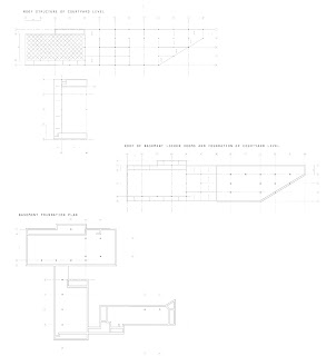
In keeping with this concept, the floor of each building in the recreation center is at a different height. An additional benefit of having floors at all different levels was that the building would be able to follow the natural slope of the topography more closely. Unfortunately, depicting the differences in height of each floor relative to all the others was a huge struggle in plan. There are four different levels described in these plans:


1) Front Entry Level - off Ella St.

2) Parking Entry Level

3) Courtyard Level 

4) Basement Level 

Cut & Fill Diagram


Wall Section


Egress Diagrams


Ventilation Section Detail 


Structural Diagrams