Monday, February 18, 2013

University of the Arts Student Center, Philadelphia


Although I struggled with the first semester project (the Bloomfield Center), my faith was restored with the passion I had for this project. I think one of the main reasons I cared so much about the project for the University of the Arts Student Center was because we got to meet some of the students we would be (theoretically) designing for. We were given a tour of the existing university buildings, and one thing became very obvious: the students are extremely segregated by their major. 

The segregation isn't a choice made my the students, it is a result of the way their campus is laid out.

Each major has its own building, and the buildings are scattered along Broad Street, mixing in with buildings that are not related to the school. In addition to this, the theaters and studios in the university buildings are embedded in a series of labyrinths which you would only be able to navigate comfortably if you spent lots of time in that building. As a result, many students don't bother to venture into the facilities that house other majors. 

My goal was to create a student center which is set up in a very intuitive, open, and predictable manner so that students from all majors could meet and enjoy each other's work comfortably. 

I thought of the U of A Student Center as a museum where the students themselves become part of the exhibit.


View down primary corridor


Rooftop terrace rendering


Concept model


Final model


Indoor auditorium detail


Detail of sunshelves


Rooftop detail


View down central corridor in model


Presentation boards (lasercut illustrations of the facade and south elevation).


Wall Section


Plans


Sections

Original Design Drawings


Bloomfield Recreation Center


Concept & Execution

Courtyard

Longitudinal Section 

Cross Section

Rear Elevation

Site Plan


Our first project of third year was a recreation center for the town of Bloomfield just outside of Pittsburgh, PA. When we went to meet with the people living in the community, they told us about how their town was becoming increasingly divided culturally. There is a rift forming between the young working professionals moving into the area, and the senior citizens, who have called Bloomfield their home for years. They came to us to present their opinions of what they would like to see in their community. Many of them said they were simply looking for a space that would draw people out of their homes and out into the community. They wanted to re-awaken the sidewalks - to promote business along their main streets and interaction between community members. 

My goal with my community center was to create a courtyard that would draw people in off of all the major streets and through the building. In order to activate this courtyard, I designed each of the three recreation center buildings open out onto it. The interaction between the courtyard and the buildings was modeled loosely off Frank Lloyd Wright's design for the Hemicycle House. 


Precedent Analysis: Wright's Hemicycle House


Entry to the Hemicycle House

Entry to Rec Center Courtyard


Due to the topography of the site, a tunnel was necessary if this particular entry to the courtyard was to align with the street that terminates at the edge of the site.  

In order to create opportunities for people to sit, play or lounge in the courtyard without depending on furniture, there are a series of overlapping slabs. This form was inspired by the highway overpass that creates an implied division down the middle of the site. If you look at the longitudinal section of the site, you will see the horizontal plane of the bridge. 

This horizontality that begins with the slabs in the courtyard ripples out into the rest of the project, as if the slabs were rising up out of the earth and becoming the roof slabs of the buildings. 

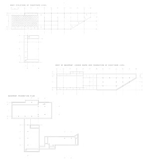
In keeping with this concept, the floor of each building in the recreation center is at a different height. An additional benefit of having floors at all different levels was that the building would be able to follow the natural slope of the topography more closely. Unfortunately, depicting the differences in height of each floor relative to all the others was a huge struggle in plan. There are four different levels described in these plans:


1) Front Entry Level - off Ella St.

2) Parking Entry Level

3) Courtyard Level 

4) Basement Level 

Cut & Fill Diagram


Wall Section


Egress Diagrams


Ventilation Section Detail 


Structural Diagrams


NCMA: A Spacial Experiment


Concept Model


Concept Diagram


Fourth story plan


Cross section 


Custom block


Walls comprised of custom masonry units


This building was designed for the National Concrete Masonry Association Competition. We were asked to showcase the possibilities of concrete masonry, and design custom blocks for our project. The program was a small live/work facility for students of The New School in New York City. Sandwiched between Frank Gehry's IAC building and the High Line, our site demanded an unique approach to space. When I started thinking about this design, I wanted to play a sort of visual trick on the building user. My goal was to create the illusion of rooms within this space - without physically enclosing them with walls. The idea was to use repeating, thin masonry walls and punch spaces out of them, creating an implied rooms within the "pages" of the building.

 The walls would be supported by steel columns, which would be clad in panels of custom masonry bricks. Doing this would allow the walls to be much thinner than would be possible if all of the walls were shear walls. The rooms within would be supported by beams embedded in the walls. Since each wall is only a few feet away from the next, it would enable the joists to span between the walls easily. 

This project was highly theoretical - an exploration of how space is perceived, not a reflection of economic realities.